ordo
agency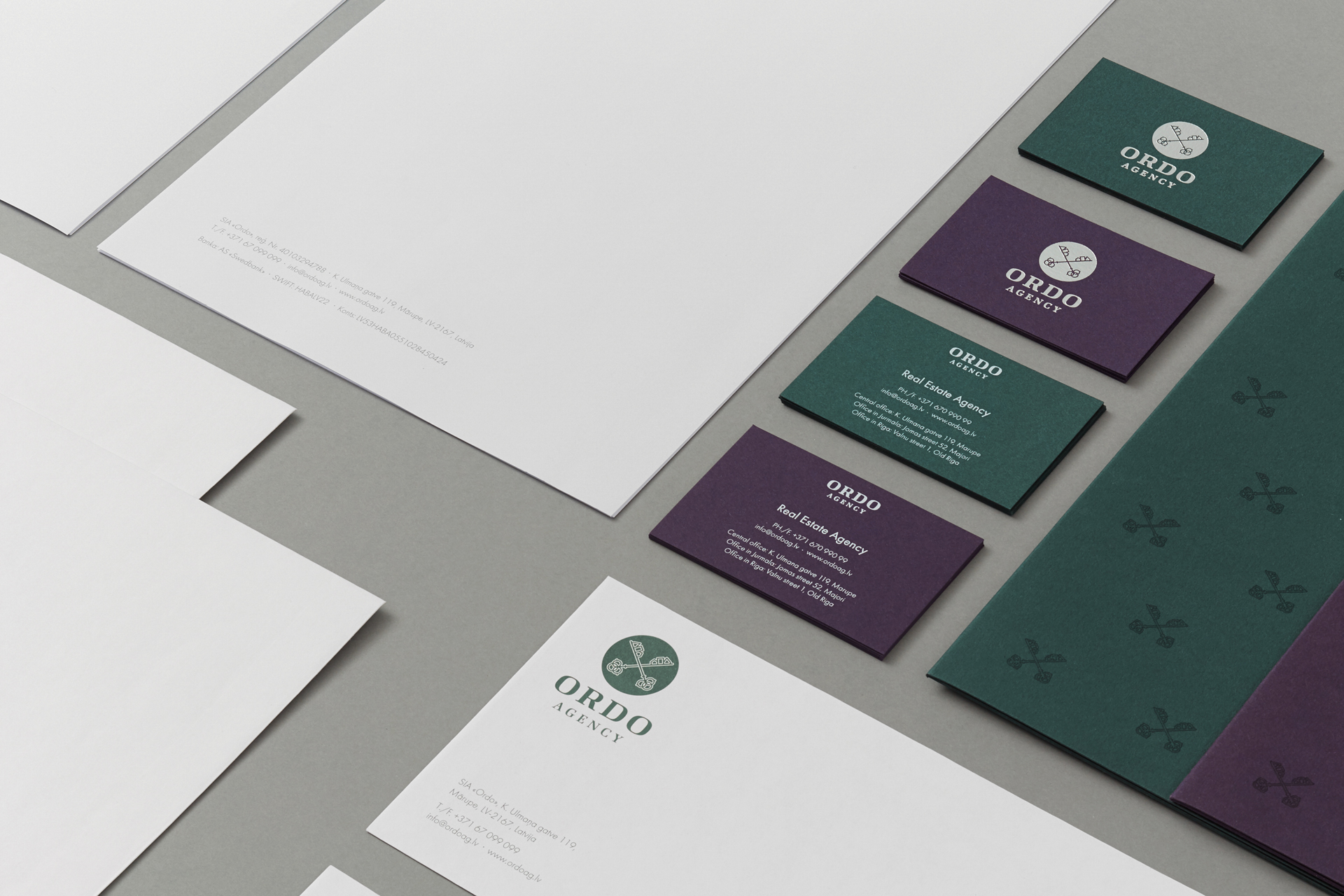
agency

In 2012 VCG reimagined and expanded the corporate visual identity program of Ordo Agency, a real estate
company specializing in premium class realty.
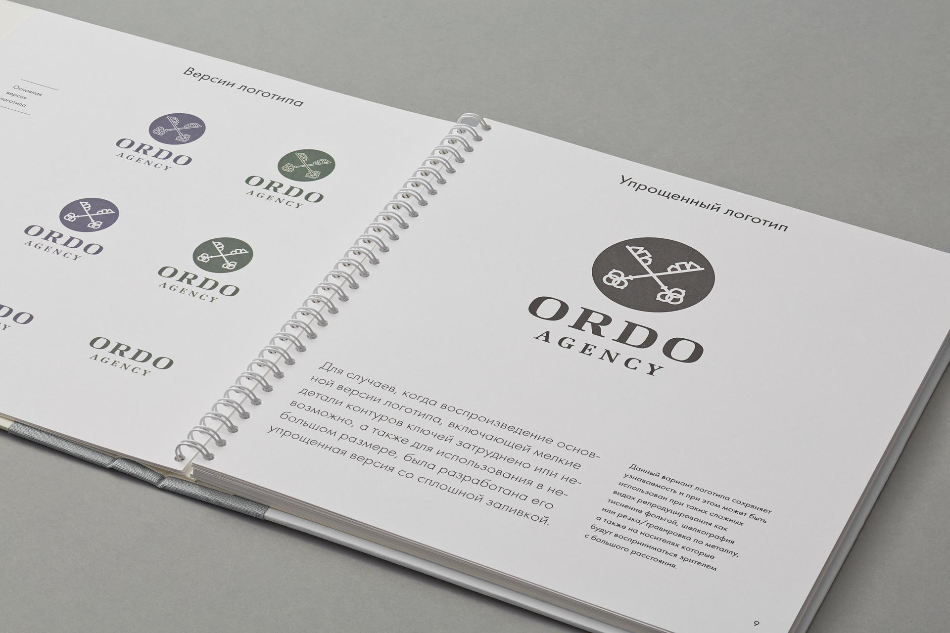
Keys of Heaven, a famous historical symbol and part of Riga’s coat of arms, were
chosen to be the main element of the new visual identity system for the company. Ordo
logotype is based on a custom lettering.

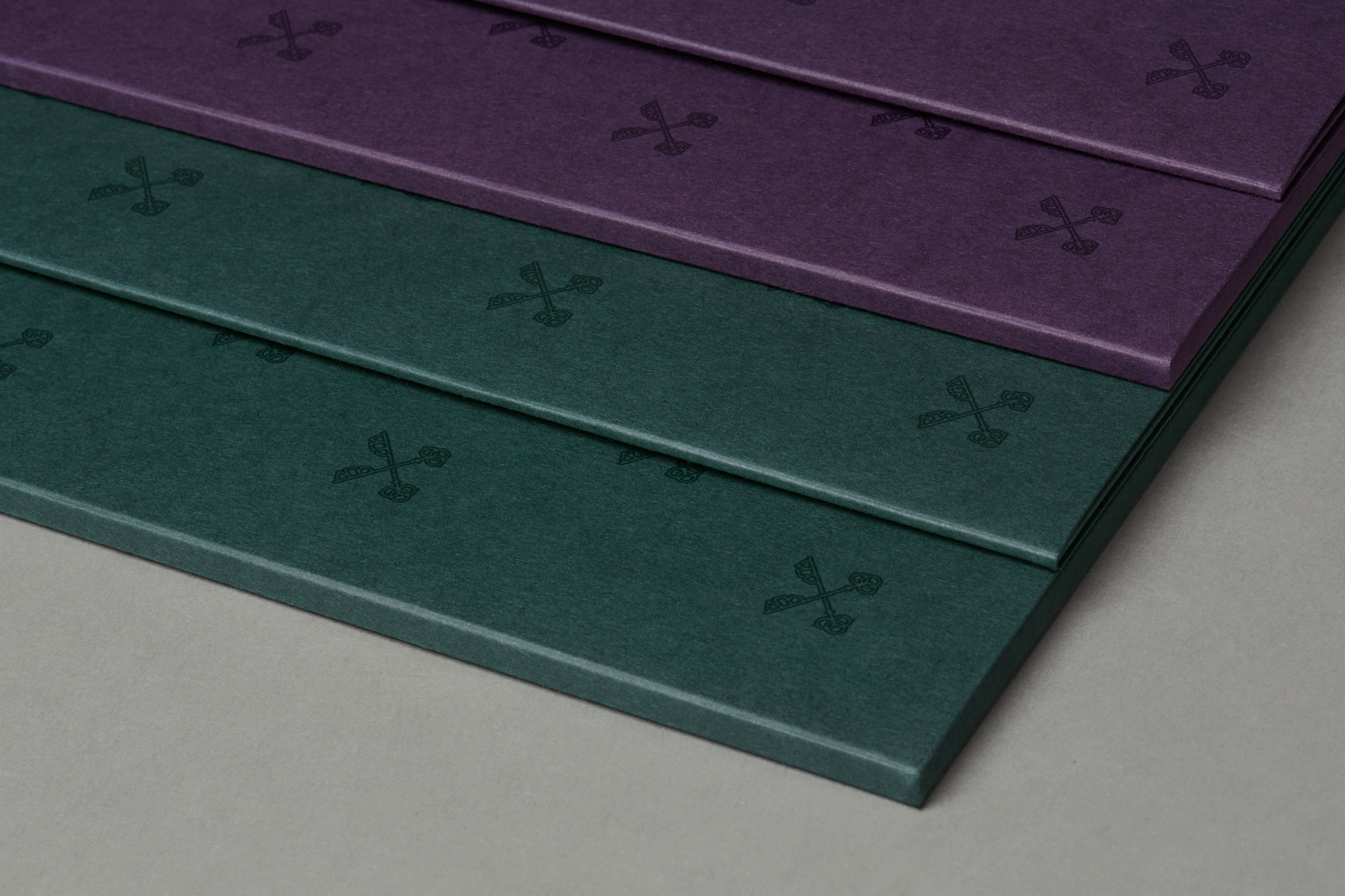
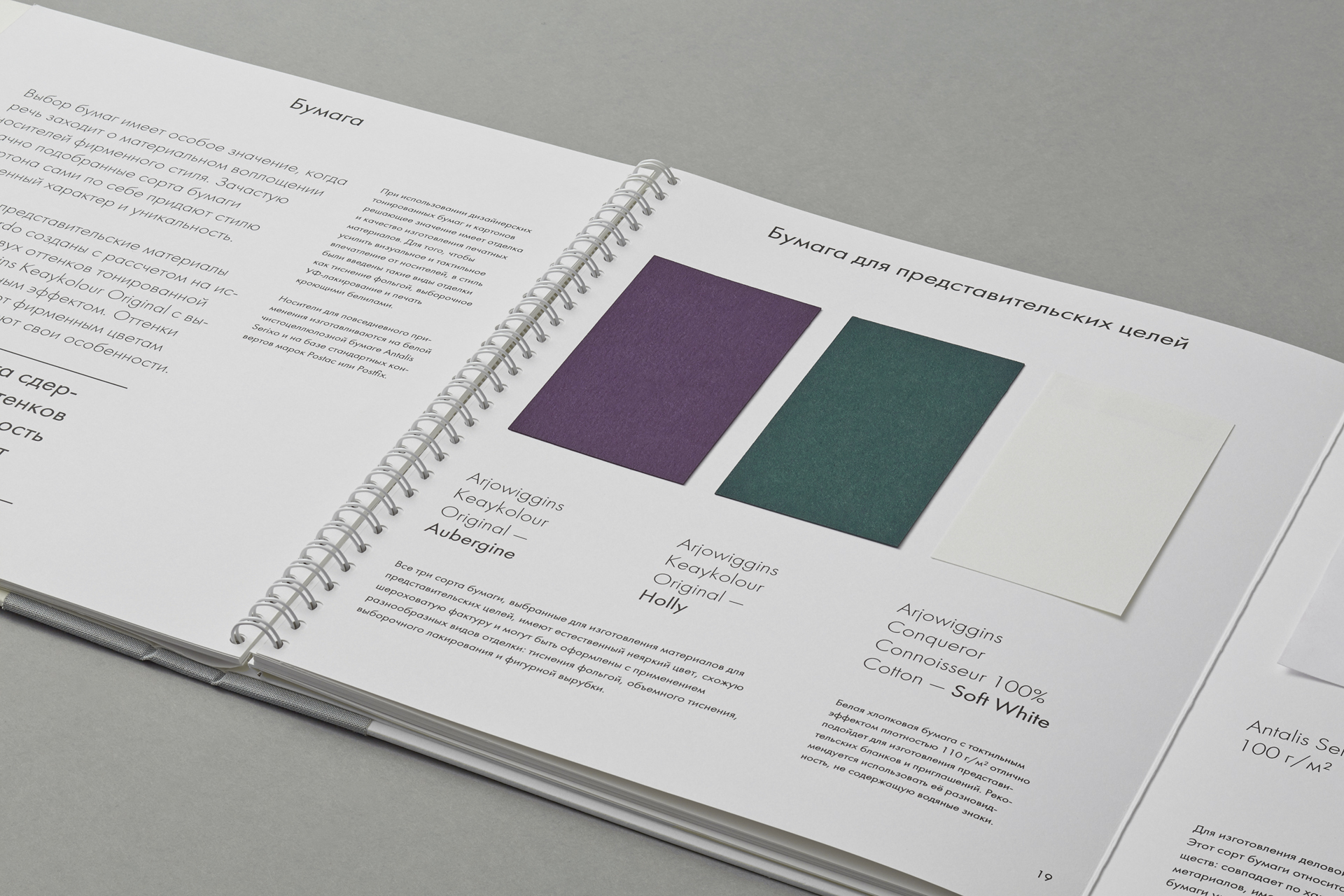
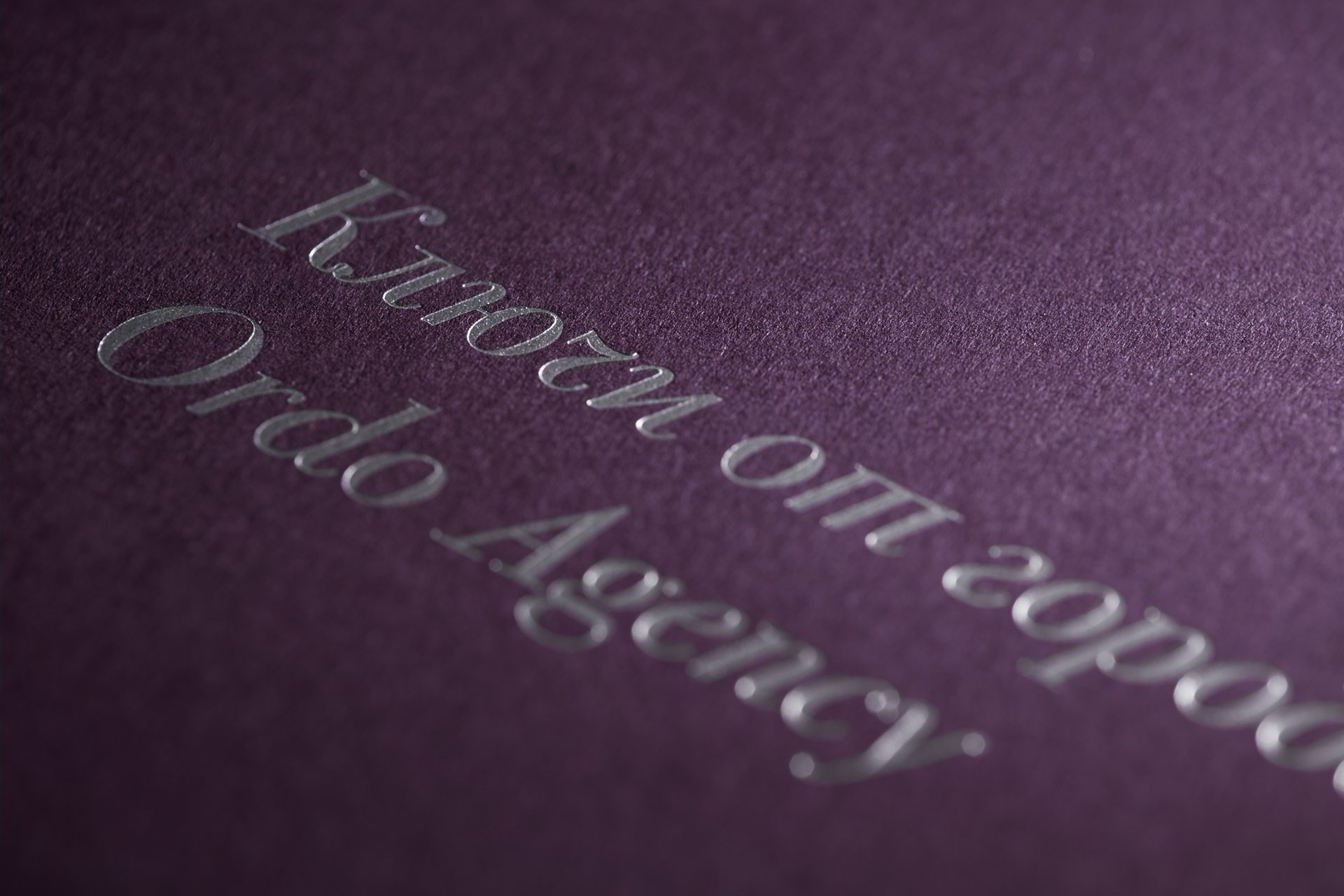
Primary promotional materials were designed using two shades
of rough-textured paper which together with the new pattern
became a recognizable element of corporate identity.
of rough-textured paper which together with the new pattern
became a recognizable element of corporate identity.
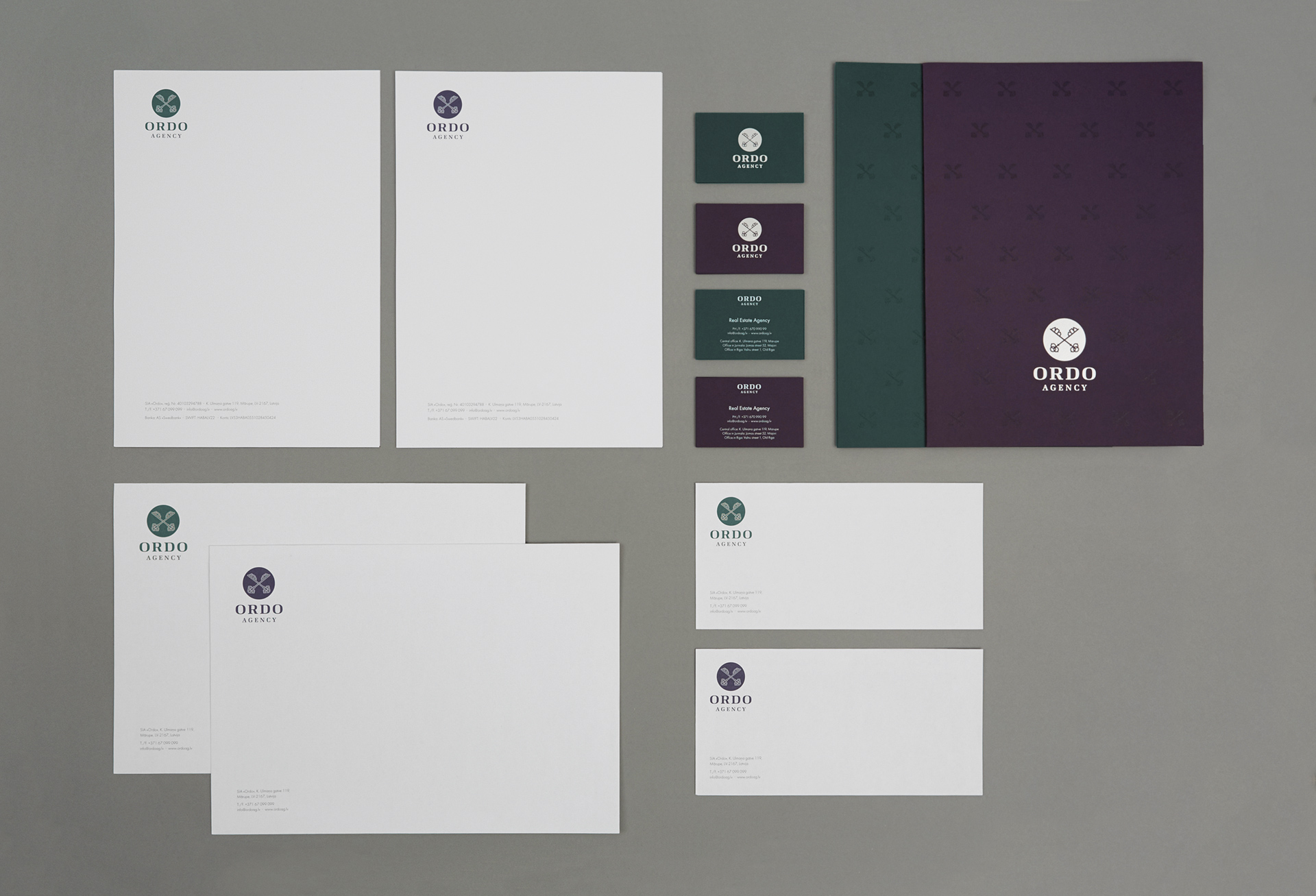
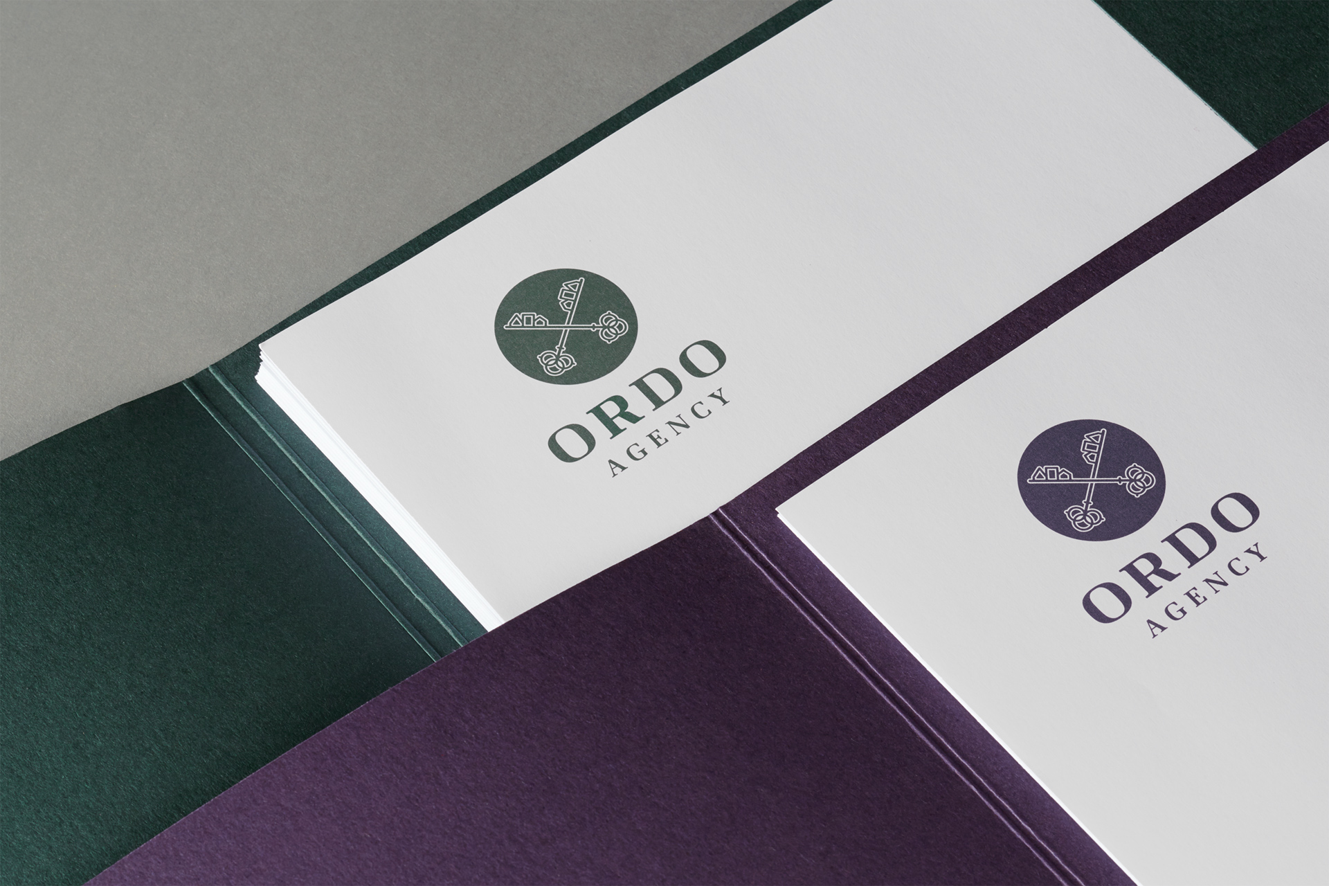
The business stationery set, including paper folders and business cards, was designed using the same
two-color approach. Word-processor letterhead templates were designed for everyday use in electronic
correspondence and office printouts.

1 / 2

Two types of folders were designed for better convenience: a thicker and a thinner version.
The thinner version perfectly fits even a 2 or 3-sheet offer, whereas a thicker folder can hold a 35-sheet contract.
Identity guidelines

1 / 5

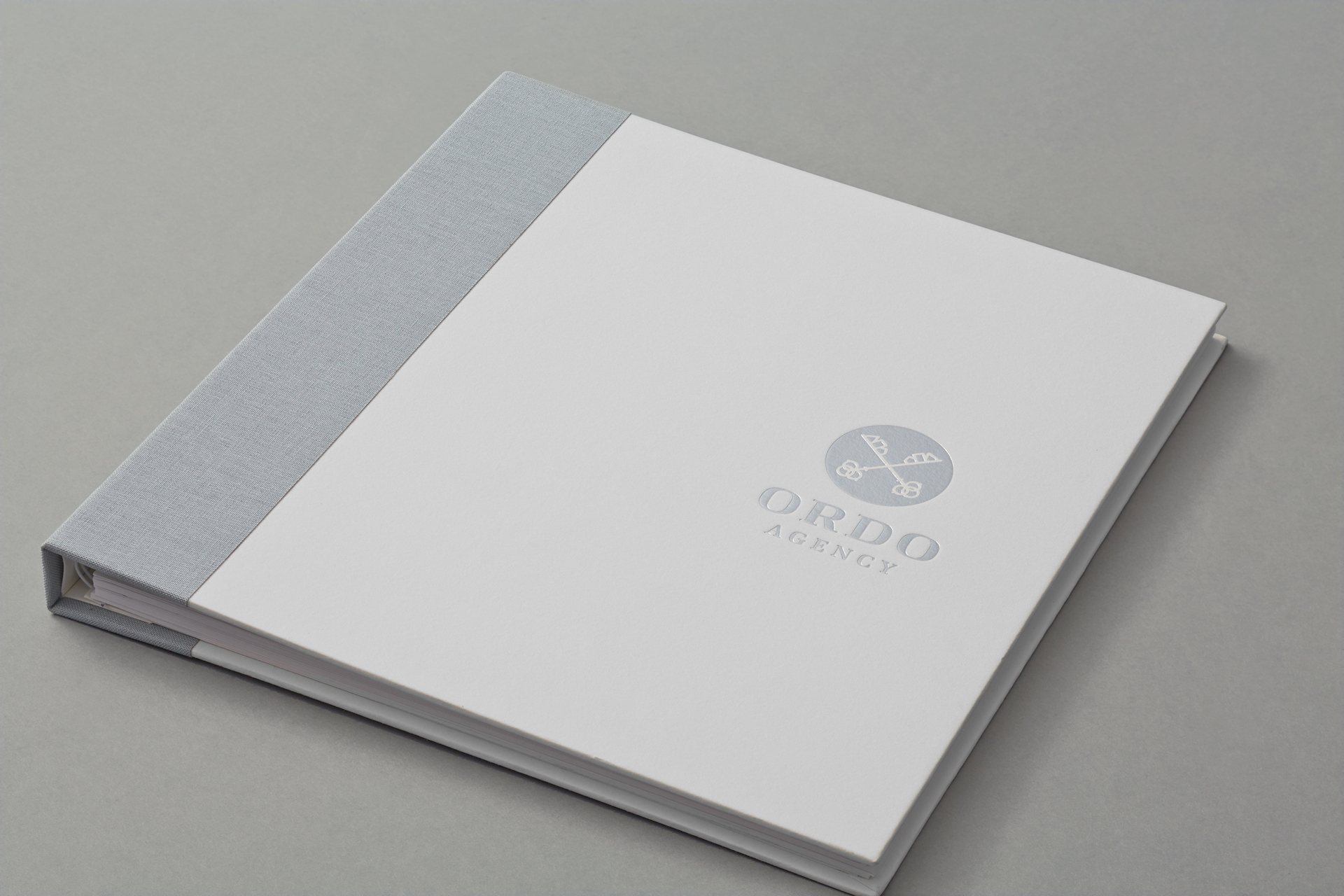
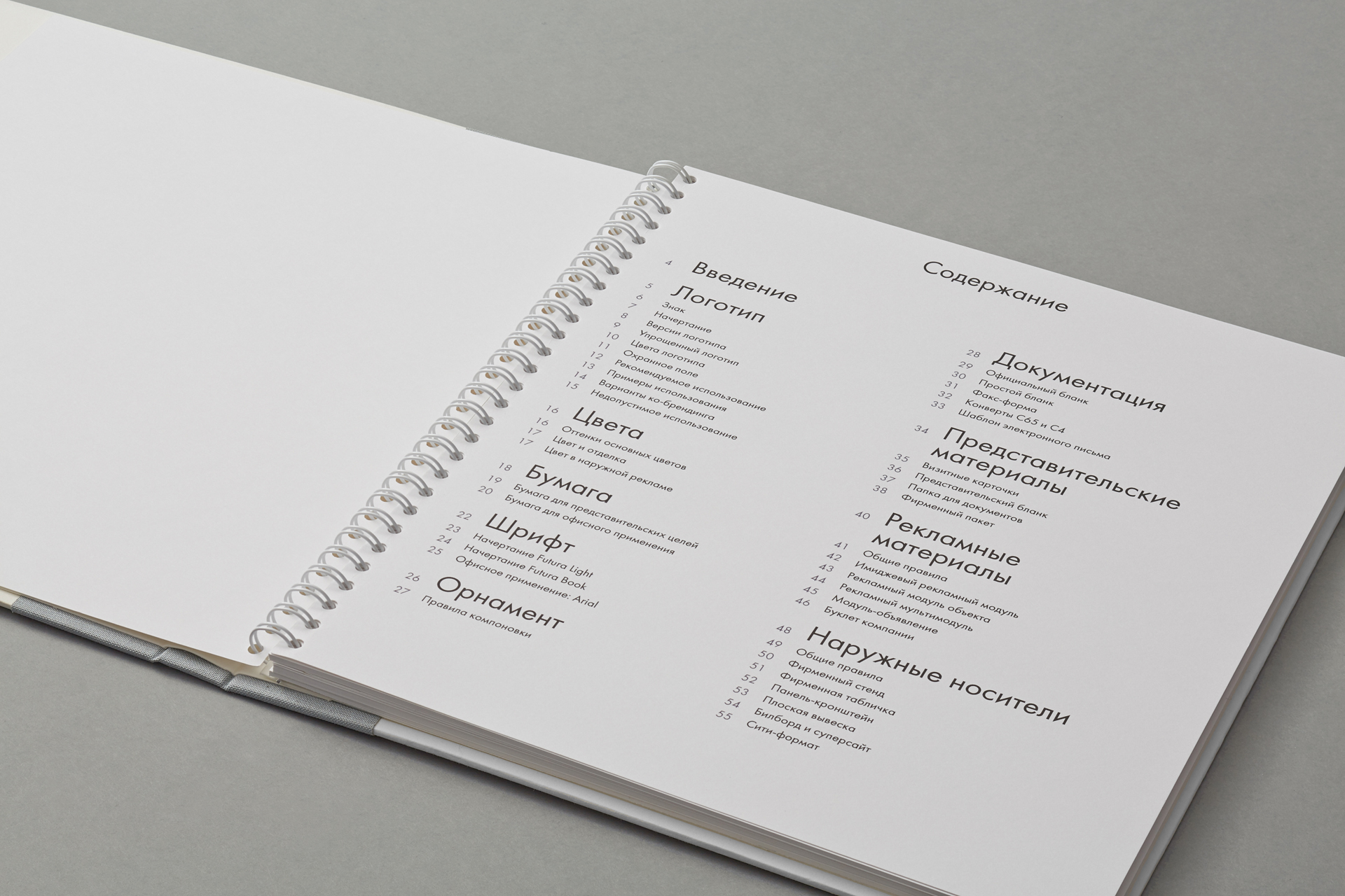
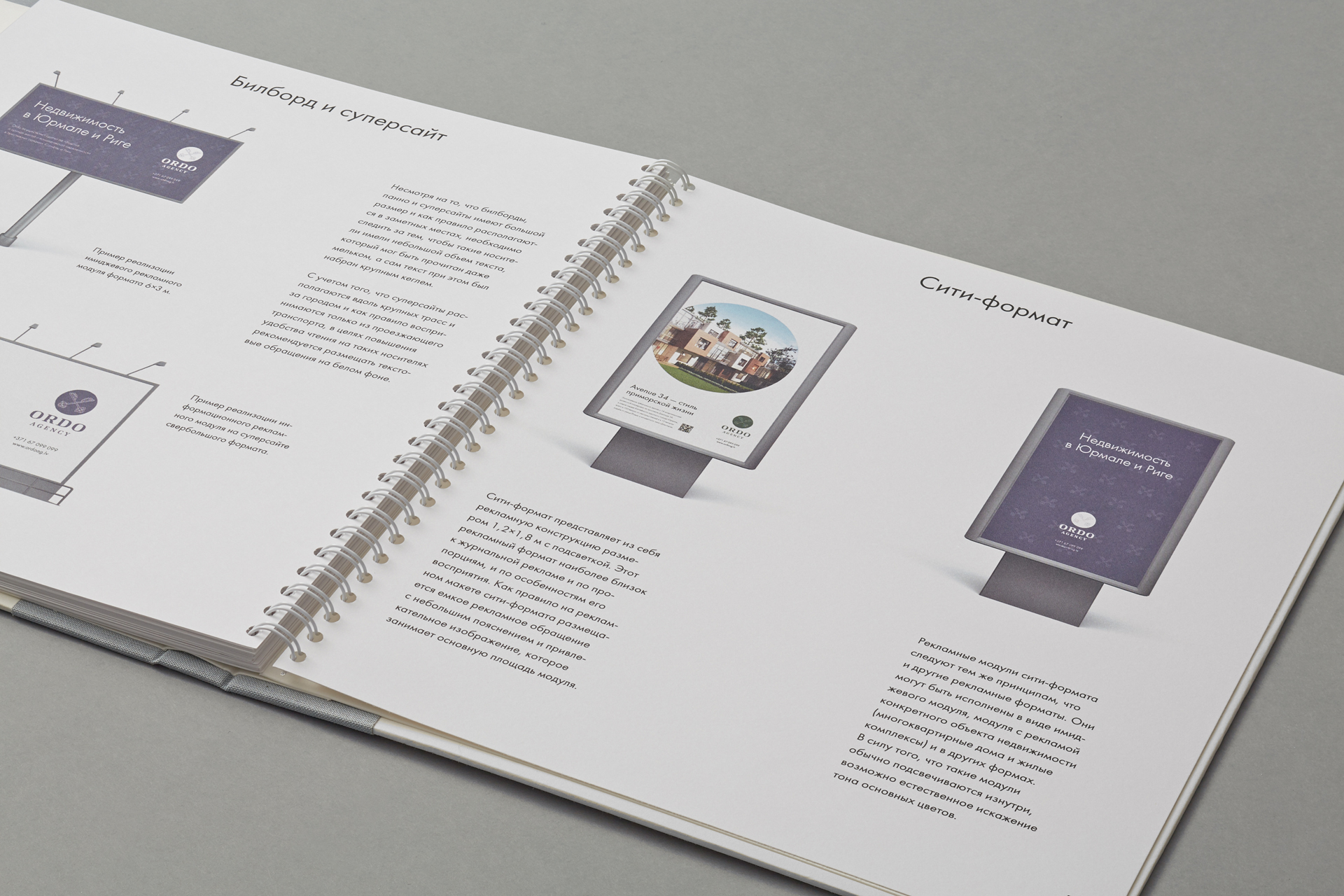
We have also prepared a comprehensive identity guidelines for Ordo, which included the descriptions of the
key identity elements, corporate colors, paper and typeface specimens, detailed description and samples of promotional items.
Corporate brochure

1 / 5

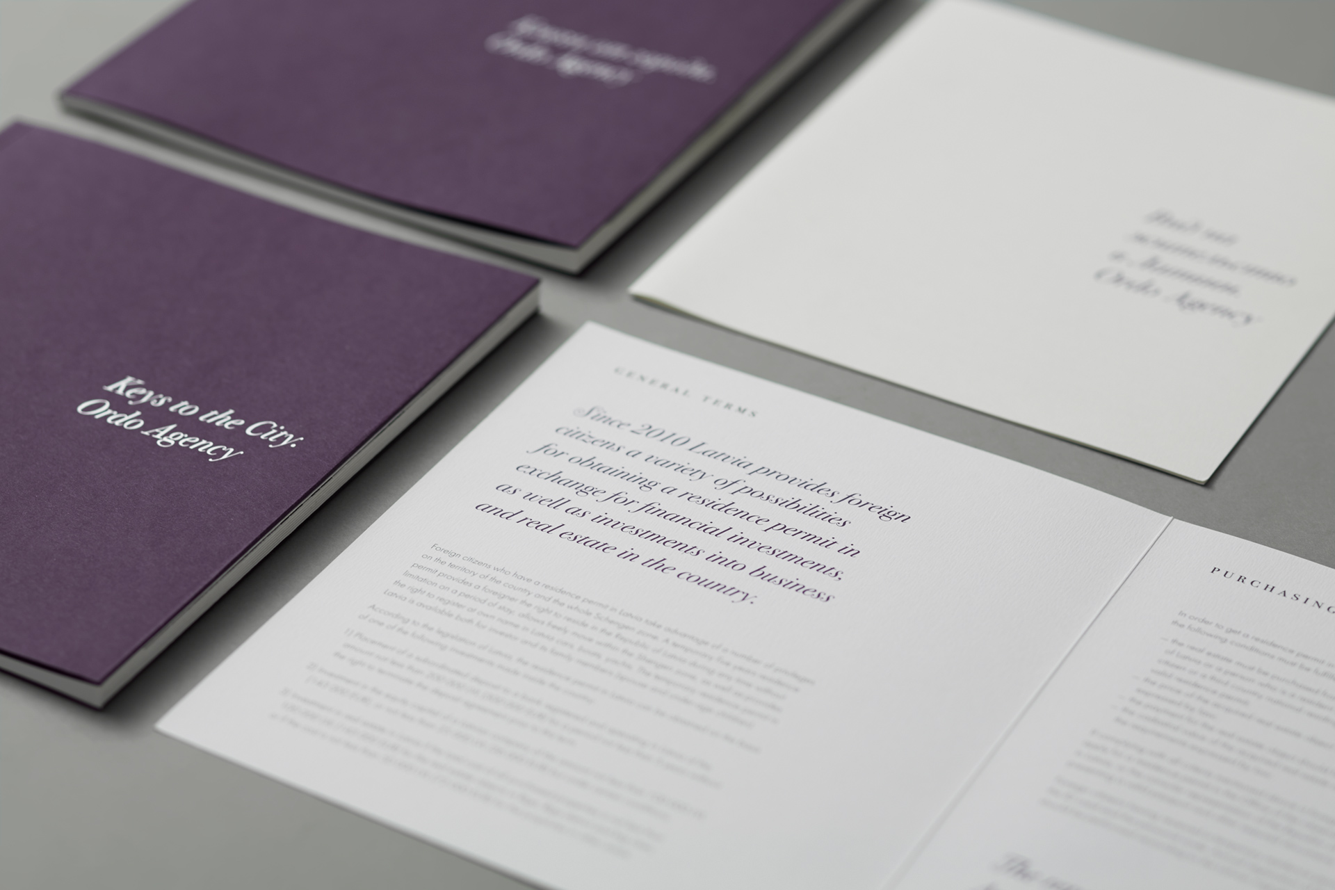
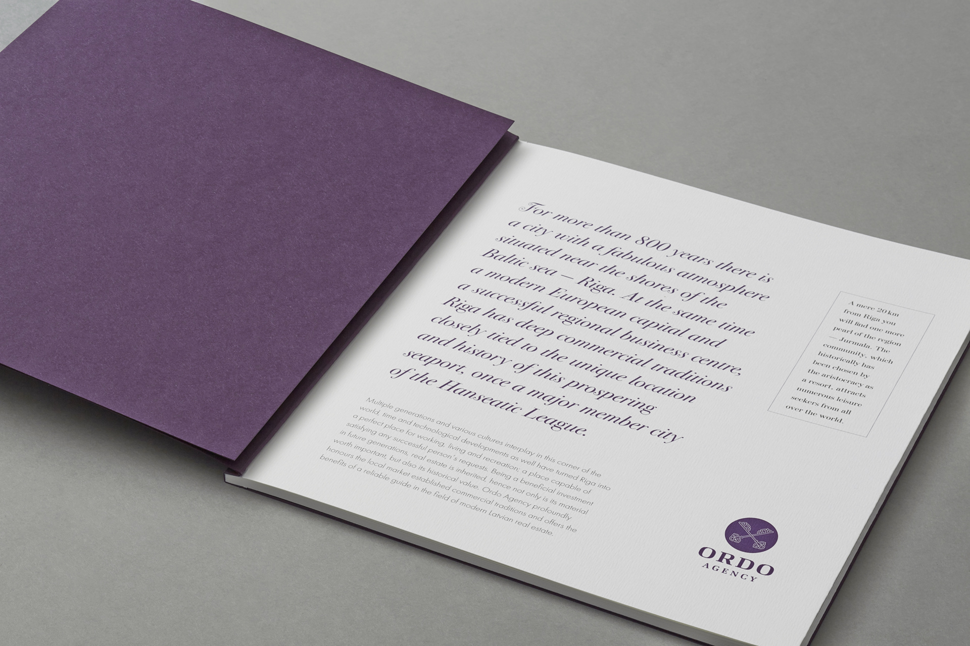
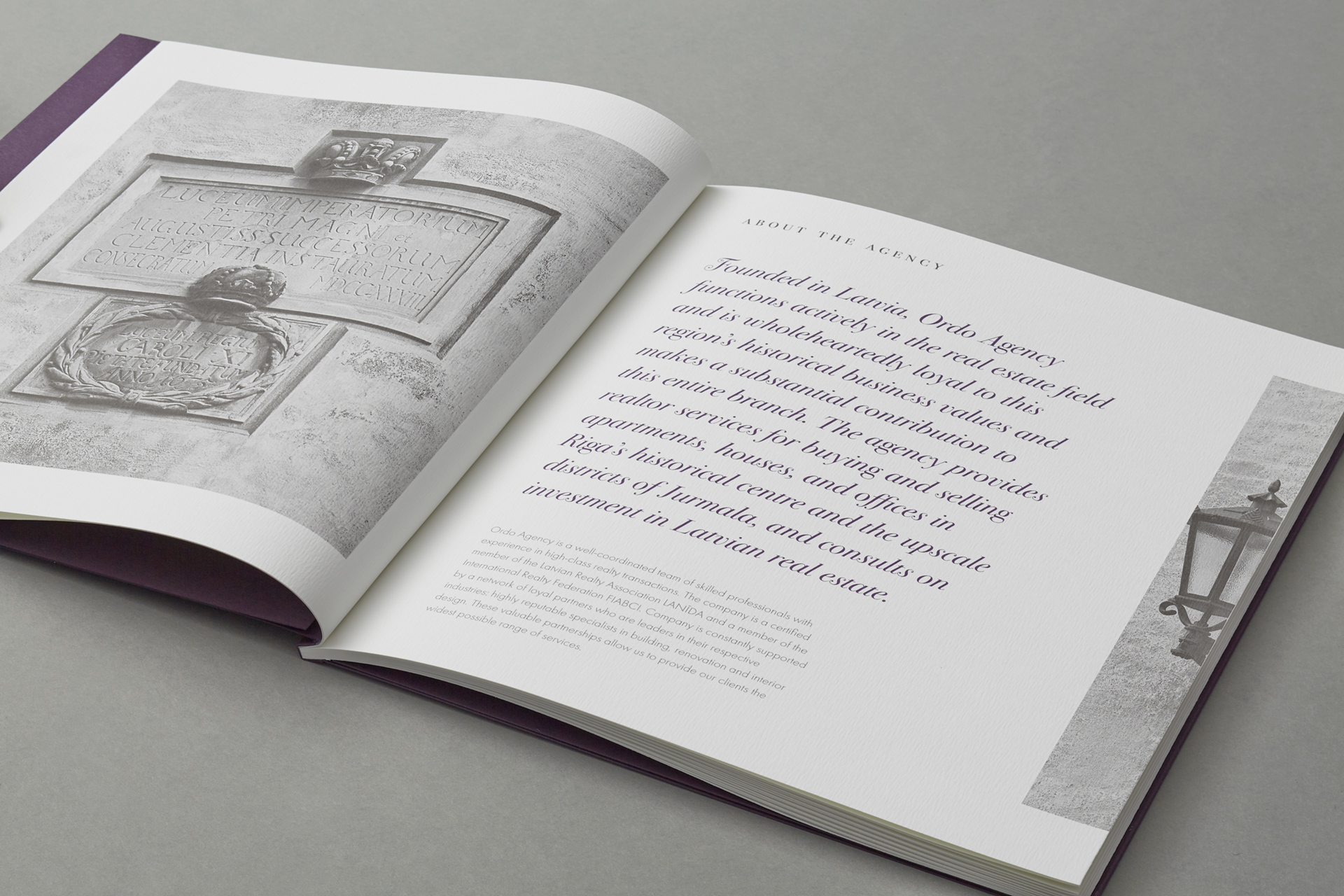
Ordo corporate brochure was designed and published in 2013. The brochure reveals the history,
values and services provided by the company. The item was printed on uncoated paper
with subtle texture using 2-color process. The ultrafine raster of 200 lpi allowed us to achieve unprecedented reproduction quality.
The brochure was bound using the French-fold binding.

1 / 3

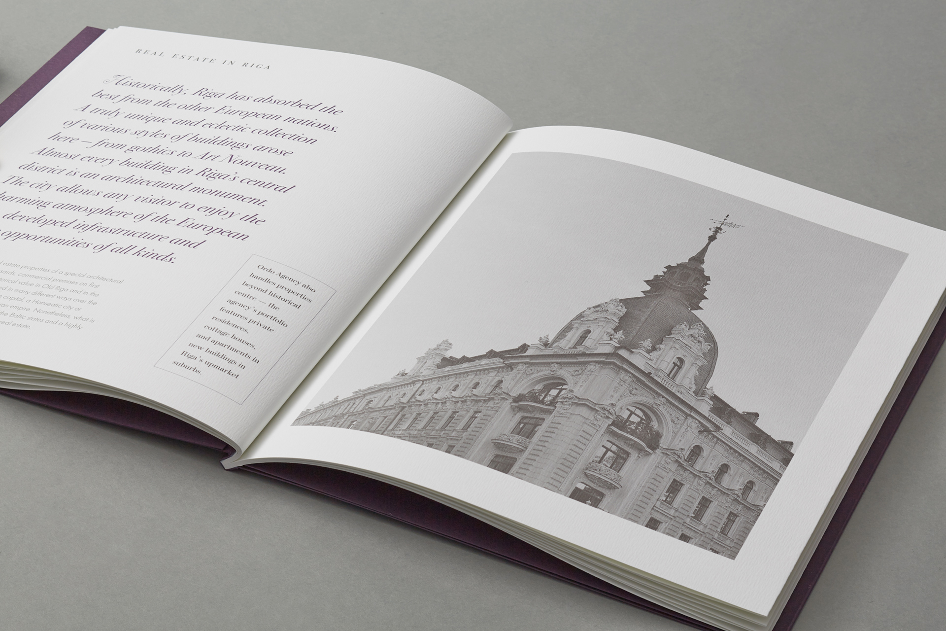
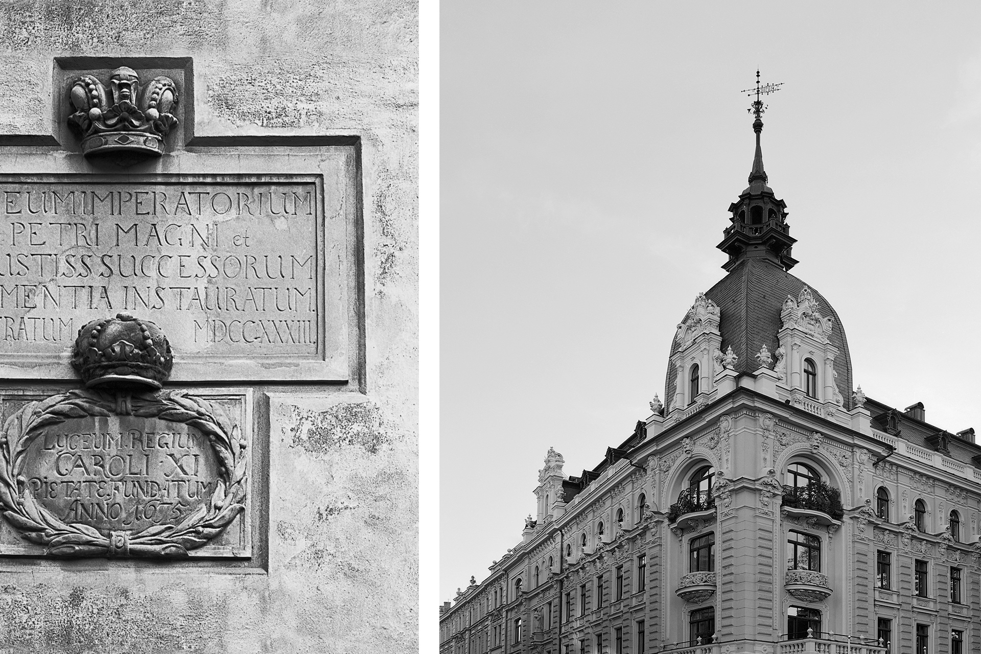
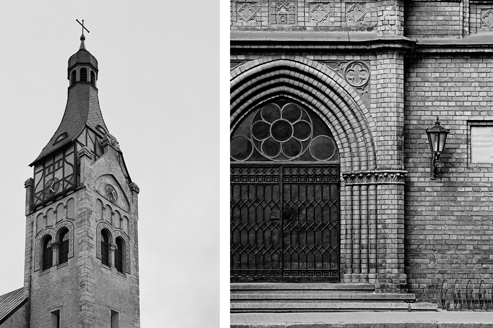
The brochure is illustrated with numerous photographs of buildings and architectural details which represent the styles
most typical for Riga and Jurmala: Gothic, Swedish style, Eclecticism, Jugendstil, National Romanticism. The photographs
were taken by a Rolleifex SL66 medium format camera with Zeiss lenses using a black-and-white film.


